Multi-option2
Summary
Allows option selections (supports enabling/disabling of options, images, nested option sets and dependencies). [Webshop]Properties
| Name | Internal name | Searchable | Information collector |
|---|---|---|---|
| Multi-option2 | ezmultioption2 | Yes. | No. |
Description
This datatype makes it possible to create multiple and distinctive groups of multi-options for each content object. The multi-options can be nested (there is a limit, see below). For each option, you can specify an additional price, an image, whether the option should be the default selection and if it should be possible to select it (sometimes you wish to force the selection of a set of options without providing a default selection for the user; in that case, the first option can be set to something like "Make a choice"). In addition, this datatype makes it is possible to set up rules for allowing/disallowing certain combinations of options.
All configuration is done at the object level. This provides great flexibility. Every object using the "Multi-option2" datatype can be different since there is no class-level configuration to be followed. In other words, if you need to represent different types of products, you can just create a simple and generic "Product" class that uses this datatype. The products (objects) themselves can be of completely different types with different traits (options). For example, you can create an object representing a computer with different options (memory, processor, etc.). At the same time, you can create another object that represents a couch; again with different options (color, finish, size, softness, etc.) and so on. All options, additional prices, rules / dependencies and so on can be defined at the object level.
The capabilities and practical usage of this datatype will be explained using an example of cars being sold through the webshop. Note that there will only be one car object. However, the options, rules and so on will make it possible to sell different versions (custom configurations) of the product. The price of the car will vary depending on the selected options. Note that some options will be default while others must be selected (the user will not be allowed to continue until a selection is made). In addition, some combination of options will not be allowed. Note that this particular feature requires JavaScript support in the browser because the validation will be done on-the-fly while the user is tweaking the options. However, there is a fallback mechanism for non-JavaScript clients. It will take care of the validation when the product is added to the basket. In this case, the product will not be added to the basket as long as an invalid set of selections is provided.
The product (car) in this example will have three different traits: body, color and seats. We will use three multi-options called "Body", "Color" and "Seats" to represent the possible combinations/variations.
The following table shows the available options for this example.
| Body | Color | Seats |
|---|---|---|
|
|
|
Each option can be assigned a short text and an additional price. It is also possible to add images for options. In the example above, images can be used to demonstrate the colors that the vehicle is available in and/or show how the different bodies look like. An option can be disabled. Disabling an option will make it non-selectable when the object is viewed. For each multi-option, it is possible to specify a default selection. If a disabled option is chosen as the default selection, users will be forced to select one of the enabled options instead. The following table shows how the default and disabled options are set for the example described above.
| Body | Color | Seats |
|---|---|---|
|
|
|
As the table shows, the default choice for body style is "Sedan", the default color is red. The "Seats" multi-option contains a new option called "Make your choice", which will be selected by default. Since this option is disabled, the user will have to select either "Cloth" or "Leather" in order to buy a car ("Make your choice" will be treated as an invalid selection).
This datatype supports hierarchical organization of the multi-options for each content object. This means that it is possible to create new multi-options beneath existing ones, thus allowing the site administrator to build complex multi-level structures. In the car example, two new multi-options called "Bumpers" and "Mirrors" added beneath the "Color" multi-option could represent the available colors of bumpers and mirrors (the "Color" multi-option represents available body colors). The following table shows the resulting two-level structure.
| Body | Color | Seats |
|
|---|---|---|---|
|
|
|
|
| Bumpers | Mirrors | ||
|
|
||
It is possible to specify dependency rules for options located in nested groups. Let's say that for example red cars can not have their bumpers painted in the same color as the body. This situation can be described using the following table where each column corresponds to one of the options of the outer group ("Color"), while the options of the nested group ("Bumpers") are represented by the rows.
| Bumpers | Color of the body |
|
|---|---|---|
| Black |
Red |
|
| Same as body |
Available |
Not available |
| Non-painted |
Available |
Available |
In a similar way, the following table demonstrates the dependency rules between the "Color" and "Mirrors" groups of options.
| Mirrors | Color of the body |
|
|---|---|---|
| Black |
Red |
|
| Silver |
Not available |
Available |
| Same as body |
Available |
Available |
| Non-painted |
Available |
Not available |
As the table shows, silver mirrors are not available for black cars and red cars can not have non-painted mirrors. If the dependency rules are specified as shown in the tables above, the system will make the specified options of the inner groups disabled depending on the options that are selected in the outer group. This is achieved by making use of JavaScript in the resulting HTML and thus the client browser must support JavaScript for it to work. If JavaScript is not supported, the interface will allow invalid selections while the visitor/customer plays around with the different options. However, the product will not be added to the basket as long as an invalid set of selections is provided. As previously mentioned, the combination of options will be validated when the user attempts to add the object to the shopping basket.
This datatype supports grouping of multi-options. A multi-option located at the top level of the structure always belongs to a group. Multi-options located beneath it (second level, third level and so on) will be considered to be in the same group. The following table shows the situation with two groups called "Exterior" and "Interior".
| EXTERIOR | INTERIOR |
||
|---|---|---|---|
| Body | Color | Seats |
|
|
|
|
|
| Bumpers | Mirrors | ||
|
|
||
In the example above, while the "Body" and "Color" multi-options belong to the "Exterior" group, the "Seats" multi-option belongs to another group called "Interior". In other words, the multi-options located at the top level are grouped. The "Bumpers" and "Mirrors" multi-options located at the second level belong to the same group as "Color".
Note that both grouping and nesting of multi-options are defined at the time of creation. It is not possible to move an existing multi-option to another group or place it beneath a different multi-option. This is why the multi-level structure must be carefully thought out beforehand. It is not recommended to create structures containing more than ten levels. The maximum number of levels is limited to 15. Refer to the source code if you need to change this limitation.
Removal of a multi-option will also remove all its sub items (multi-options located beneath it). By removing all multi-options that belong to a group, you can remove the the group itself. Note that this is the only way of removing a group.
The following screenshot shows the class attribute edit interface for this datatype.

Class attribute edit interface for the "Multi-option2" datatype.
Object attribute edit interface
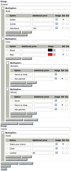
The following screenshot shows the object attribute edit interface for this datatype.
As you can see from the screenshot above, options are represented as lines in the table (one table for each multi-option). The "Option" field contains the name of the option. The value specified in the "Additional price" column will be added to the product price in case the corresponding option is selected. The "Image" column can be used to add images to options. When viewing a product, users will see a thumbnail/icon that links to the original image. In this case, the system will display options as a list with radio buttons (if no images are added, the options are shown using a drop-down list). Note that it is possible to add other types of related objects instead of images, but the default templates are for images only.
While the "Def" column with radio buttons can be used to specify the default selection, the "Dis" column contains checkboxes for disabling the options. The "Add option" button can be used to add a new empty line to the table. To remove one or more options, select them using the checkboxes located in the first unnamed column and click the "Remove selected" button.
To add a new multi-option beneath an existing one, click the "Add multioption sub level" button. Note that this button will not be shown for multi-options that already have sub items (multi-options located beneath them). In this case, the system will show a list of the sub items with checkboxes on the left side plus two new buttons called "Remove multioption" and "Add multioption" below. These buttons are present at each level of the structure, allowing you to add and remove multi-options located at the different levels. Note that removing a multi-option will also remove all its sub items.
Adding a new group of multi-options
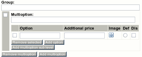
The "Add group" button makes it possible to add a new group of multi-options. The following screenshot shows a part of the object attribute edit interface that corresponds to a newly created empty group of multi-options.

A part of the object attribute edit interface for the "Multi-option2" datatype.
As the screenshot shows, a newly created group consists of one multi-option containing only one option (all the fields are empty). At this stage, you should enter the name of the group and the name of multi-option, plus create the necessary options. Nested multi-options can be created using the "Add multioption sub level" button.
The "Add multioption" button allows you to add new multi-options to the top level within the group. The system will show all multi-options that belong to the group with checkboxes on the left hand side. The "Remove multioption" button can be used to remove selected multi-options. The group itself is automatically removed when all multi-options that belong to it are removed.
Adding dependency rules
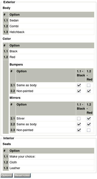
The "Rules" button located at the bottom makes it possible to specify dependency rules for nested multi-options. When this button is clicked, the object attribute edit interface will change. Instead of showing an interface for editing the options, the system will show an interface that can be used to define the rules. Note that this behavior isn't common when it comes to other datatypes. The following screenshot shows what the object attribute edit interface will change into when the "Rules" button is clicked.
As the screenshot shows, every nested multi-option ("Bumpers" and "Mirrors") has a table with checkboxes that make it possible to specify which options are available for each possible value of the parent multi-option ("Color"). By default, all checkboxes are selected, meaning that all options are available. The screenshot above shows a situation which follows the rules that were discussed earlier. In other words, the following limitations are introduced:
- Red cars can not have bumpers painted in the same color as the body.
- Black cars can not have silver mirrors.
- Red cars can not have non-painted mirrors.
The "Reset rules" button located at the bottom of the interface makes it possible to restore the default configuration (allowing all possible combinations). Note that pressing this button will wipe out the custom rules. Clicking the "Options" button will bring you back to the interface for editing options. In other words, the "Rules" and the "Options" buttons make it possible to switch between the two object edit interfaces of this datatype.
Raw output
The ".content" of an ezcontentobjectattribute object using this datatype returns an ezmultioption2 object.
Julia Shymova (31/07/2007 12:24 pm)
Julia Shymova (19/06/2008 1:45 pm)


Comments
There are no comments.