The "Content structure" tab
The "Content structure" tab allows the user to browse and manage the nodes that belong to the "Content" top level node. This is the part that makes up the actual structure of the site. It may contain menu items, folders, articles, comments, products, forum messages and so on. The following screenshot shows what the administration interface displays when the "Content structure" tab is selected.
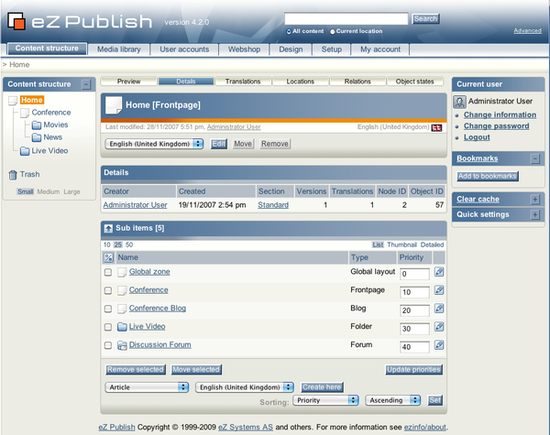
The interface consists of two parts: a left menu and a main area with multiple windows.
The left menu
The left menu will display an interactive tree containing the nodes that belong to the "Content" top level node. In addition, it also provides access to the trash. This menu can be enabled or disabled using the +/- button located in the upper right corner of the menu window itself. The state of the window is stored for each user. The following screenshot shows the left menu of the "Content structure" tab in a hidden/disabled state.

Disabled tree menu.
As the screenshot indicates, the window will not display the tree when the menu is disabled/hidden. However, it will still show the trash and the small/medium/large links, which can be used to adjust the horizontal size of the menu. The selected size is stored for each user. Unlike the horizontal size, the vertical size can not be adjusted. The window will automatically adjust itself depending on the height of the tree that is being displayed. The following screenshot shows the menu in a shown/enabled state.
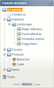
Enabled tree menu.
The tree menu in eZ Publish behaves very much in the same way as the interface of a typical file browser in a modern operating system. It allows the user to view and explore the depths of the content tree by expanding the different nodes. This can be done using the small +/- buttons that are located on the left hand side of the icons. A missing +/- means that a node does not have any children and thus it can not be explored. If the target browser does not support JavaScript or if JavaScript support is disabled, the tree will be displayed as a static HTML list. In this case, the tree will be fully expanded at all times.
A node can be selected by clicking on its name. Whenever a different node is selected, the interface will reload and the main area will display the selected node.
Configuration issues
In eZ Publish version 3.10, a new implementation of the tree menu (called "dynamic content structure menu") was introduced. Using the old implementation, the display logic eats a lot of server CPU and network bandwidth on large sites, specially if the system is set up to show all nodes. The new implementation is based on AJAX technology, which makes it possible to create the menu structure on the fly. This boosts the performance of the menu and reduces the usage of network bandwidth.
Refer to the "Tree menu configuration" part of the "Upgrading from 3.9.x to 3.10.y" page for information about configuring the tree menu.
The popup menu
When the interface is displayed in a browser with JavaScript support enabled, it is possible to bring up a context sensitive menu. This menu can be accessed at different parts of the interface, it provides quick access to commonly used functions. The context sensitive menu of the node tree can be accessed by clicking on one of the icons. The icon must be clicked using the left (or primary) button on pointer devices with multiple buttons. The following screenshot shows the popup menu.
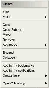
Content structure popup menu.
The title of the menu is the name of the node/object that was clicked. In the example above, a node called "News" was clicked. The following table shows the different menu items along with a short description.
| Item | Description |
||||||||||||||
|---|---|---|---|---|---|---|---|---|---|---|---|---|---|---|---|
| View |
Selects the node (same as clicking on the node's name). The selected node will be displayed in the main area. |
||||||||||||||
| Edit |
Edits the node (same as clicking on the "Edit" button in the first/preview window in the main area). |
||||||||||||||
| Copy |
Creates a copy of both the node and the object that it encapsulates. The user will be asked to select a location for the newly created node. Please note that only the selected/clicked node will be duplicated, its children will be left alone. |
||||||||||||||
| Copy subtree |
Works in the very same way as the "Copy" function (described above). However, this feature creates a copy of an entire subtree. In other words, if a node with children is selected, then both the node and its children will be duplicated. Please note that this operation may time out if the selected subtree contains many nodes. An alternate solution is to use the "ezsubtreecopy.php" script from the command line. This script is located in the "bin/php/" directory. |
||||||||||||||
| Move |
Moves the node from one location to another. The user will be asked to select a new location for the node. |
||||||||||||||
| Remove |
Removes the node. If the selected node is the only one referencing the object, then the object itself will also be removed. |
||||||||||||||
| Advanced |
|
||||||||||||||
| Expand |
Unfolds the target node displaying all the nodes that are below it. This feature can be used to quickly explore a subtree (without having to repeatedly click the +/- buttons). |
||||||||||||||
| Collapse |
Does the opposite of "Expand", it folds/collapses an open subtree. |
||||||||||||||
| Add to my bookmarks |
Adds the node to the bookmarks of the user who is currently logged in. |
||||||||||||||
| Add to my notifications |
Adds the node to the notifications of the user who is currently logged in. |
||||||||||||||
| Create here |
Creates a new node of a selected type (as a child of the node that is being viewed). |
||||||||||||||
| OpenOffice.org |
Provides an interface for exporting and importing content to/from OpenOffice files (refer to the Open Document Format extension documentation). |
The main area
The purpose of the main area is to display information about the currently selected node. It consists of miscellaneous windows where each window provides a dedicated interface. The following screenshot shows a typical view of the main area.
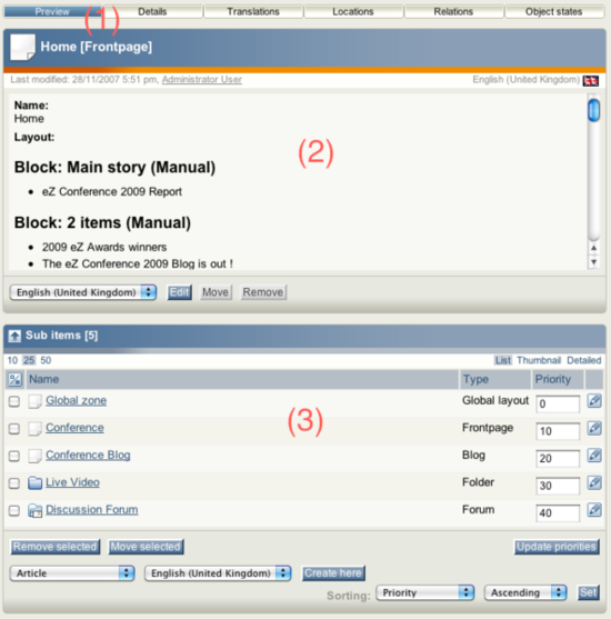
The top (2) and the bottom (3) windows are always visible. While the top window displays the contents of the selected node, the bottom window shows the node's children. In other words, if there are any items below the selected node, they will be shown in the bottom window. The horizontally aligned switches (1) in the upper area control the visibility of the different windows. A bluish background indicates that a switch is on and thus the window that it controls will be active/visible. The following text gives a comprehensive walk-through of the different windows.
The preview window
The purpose of the preview window is to display the actual contents (the attributes) of the object that is referenced by the selected node. Unlike the other windows, this window can not be turned off completely using the "Preview" switch. Deactivating the switch will only hide the window's contents. The following screenshot shows the window in a deactivated/collapsed state.

Collapsed preview window.
When the window is activated, it will display the attributes of the object. The following screenshot shows the window in an active state.
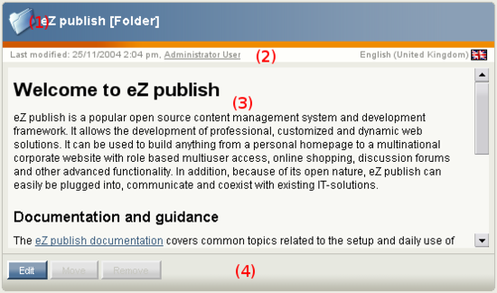
Activated preview window.
(1) Title bar
The title bar consists of three elements:
- An icon indicating the object type. Clicking on this icon brings up a popup menu (see below).
- The name of the object.
- The name of the class which the object is an instance of (encapsulated in square brackets).
(2) Information bar
The information bar contains information about the version and the translation that is being viewed. The left part of this area reveals when the object was last modified along with a named link to the user who did the actual modification. The right area reveals the translation that is being displayed.
(3) Object attributes
The main area of this window displays the object's attributes according to the order that is specified in the class definition. The attributes are visualized using the standard view templates for the datatypes.
(4) Button bar
The bottom of this window contains a button bar. At the minimum the following buttons are available: "Edit", "Move" and "Remove". These actions are exactly the same as the ones that are present in the popup menu of the left menu. Additional buttons will appear depending on the object's attributes. For example, if the object has a price attribute, then the "Add to wishlist" and "Add to basket" buttons will appear. If the object contains an attribute that is an information collector, a button labelled "Send" will appear.
Details
The purpose of the details window is to provide additional information about the selected node and the object that it encapsulates. The following screenshot shows the details window.

Node and object details.
As the screenshot indicates, this window reveals the following information:
- The user who initially created the object.
- The exact date/time when the object was initially created.
- The section that the object belongs to.
- The number of versions that the object contains.
- The number of translations that the current version contains.
- The ID number of the node.
- The ID number of the object.
Translations
The purpose of the translation window is to show the languages in which the last published version of the object that is being viewed exists. This window can be activated by clicking the "Translations" switch located in the upper area. (Note that the switch will not be shown in case only one translation language is available.) The currently selected translation is displayed using bold characters. The following screenshot shows the translations window.
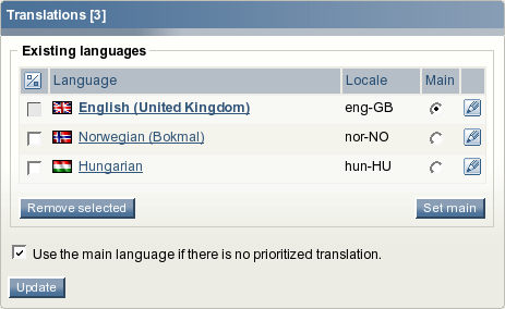
Translations window.
As you can see from the screenshot above, the table reveals the following information for each language/translation:
- The language itself (this is the full language name).
- The locale of the language.
- Whether the language is the initial/main language for the object or not.
It is possible to edit a translation by clicking on the language's corresponding edit icon (on the right hand side). Clicking on a translation name will reload the page and the selected translation will be displayed in the preview window. When either one or several languages are selected using the checkboxes (on the left hand side), the "Remove selected" button can be used to carry out the actual removal of the selected translations. The "Set main" button can be used to change the initial/main language. The initial/main language can not be removed.
The "Use the main language if there is no prioritized translation" checkbox makes it possible to mark the object that is being viewed as "always available" (the object will be available on any siteaccess regardless of the site language settings).
Locations
The purpose of the locations window is to reveal the different nodes (locations) that are associated with the object which is being viewed. In eZ Publish, each object is represented by at least one node within the tree. The currently selected node is displayed using bold characters. The following screenshot shows the locations window.

Locations window.
As the screenshot indicates, the table reveals the following information for each location/node:
- The location itself (this is the actual node path).
- The number of items that are present below a certain node.
- The visibility of a node (visible, hidden, hidden by superior).
- Whether the node is the main node or not.
It is possible to add new and remove existing locations using the "Add locations" and the "Remove selected" buttons. The "Set main" button can be used to change the main node. The "Hide" and "Reveal" links can be used to alter the visibility state of a node. Clicking on "Hide" will hide the corresponding node along with its children. Clicking on "Reveal" will do the opposite. Please refer to "The content node tree" and the "Node visibility" documentation pages for more information about objects, nodes and the hide feature.
Relations
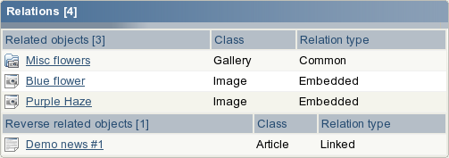
The purpose of the relations window is to reveal information about objects that are either used by or use the object that is referenced by the object being viewed. In eZ Publish, any type of object can be connected to any other type of object. This feature is typically useful in situations when there is a need to bind and/or reuse information that is scattered around in the system. The following screenshot shows the relations window.
Relations window.
The screenshot above reveals that the object being viewed makes use of two images and a gallery. In addition, the object itself is being used by an article called "Demo news #1". Please refer to the "Object relations" documentation page for more information about how this part of the system actually works.
Sub items
The primary purpose of this window is to reveal information about nodes that are located directly below the one which is being viewed. In addition, it allows the following functionality:
- Creation of new nodes.
- Removal of existing nodes.
- Editing of existing nodes.
- Configuration of the selected node's sorting settings.
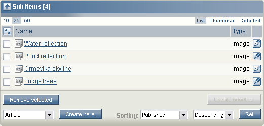
It is also possible to access the popup menu described earlier by left-clicking the icons in the list. The following screenshot shows the sub items window.
Sub items window.
(1) Limitation
The limitation links control the number of nodes that will be displayed per page. The default selection is 25, which means that the list will consist of several pages if there are more than 25 nodes below the one that is being viewed.
(2) View mode
This selector makes it possible to choose between different view modes. There are three settings:
- List - a simple list of nodes
- Thumbnail - images are shown as thumbnails
- Detailed - a detailed list for experienced users
(3) Node list
The main area of the child list contains the actual nodes which are located directly below the one that is being viewed. The checkboxes on the left hand side can be used to select nodes for removal. Above the checkboxes, there is a button that can be used to invert the current selection. For example, if no nodes are selected, when pressing this button all the nodes will be selected.
(4) Removal of nodes
When either one or several nodes are selected, the "Remove" button can be used to carry out the actual removal of the selected nodes.
(5) Creation of nodes
The interface below the "Remove" button can be used to create new nodes of different types. The dropdown list makes it possible to choose the type of node that will be created. This list will typically contain classes from all class groups except the "Users" and the "Setup" class groups.
The "Create here" button will start the actual creation process and thus the system will display the object edit interface. When editing is done, the newly created node will be placed at the location where the user clicked the "Create here" button. For example, if the user navigates into a folder called "International" inside another folder called "News" and creates an article, the article will be placed in the "International" folder.
(6) Sorting controls
The sorting controls are located towards the lower-right part of the "Sub items" window. These controls can be used to determine how the nodes that are under the one that is being viewed should be sorted. It is possible to control both the sorting method and the direction by making use of the dropdown lists. When done, the "Set" button must be clicked to store the new settings.
Please note that the sorting settings may not be used by the template that displays the nodes. In other words: changing the sorting in the administration interface may not be visible on the site. This part is completely up to the developer who creates the view templates for the different nodes.
Priority sorting
When the sorting method is set to "Priority", the node list in the "Sub items" window will contain a row of input fields. In addition, the "Update priorities" button will become enabled. The input fields can be used to manually sort the nodes. It is possible to use both negative and positive integers (zero included). The "Update priorities" button must be clicked in order to store the new/changed priorities. Please note that the direction of the sorting (ascending or descending) will still be controlled by the direction dropdown list.
Balazs Halasy (04/10/2005 9:13 am)
Geir Arne Waaler (24/08/2010 1:17 pm)

Comments
How to report mistakes made in the documentation
Wednesday 24 January 2007 9:26:05 am
Svitlana Shatokhina
Wrong link
Monday 22 January 2007 10:52:59 am
Kristof Coomans
I also like to know which is the correct way to report mistakes made in the documentation section: using the bug tracker or posting a comment? Please document this or point me to the place where it is documented. Thanks!